I took this picture after church around noon. Since the sun is shining over the building, the patterns have yet been created in my space. There are marks beginning to form on the floor that suggest some of the sun is coming in. Without the sun shining in the windows, it is dark in the space which makes artificial lighting needed. The sunlight helps bring in a significant amount of light into this space as observed in the past weeks.
Saturday, February 28, 2009
Friday, February 20, 2009
Sketch Series #2::Shane's Rib Shack
Shane's Rib Shack located on Battleground, is mainly lit by recessed lighting throughout the space. The recessed lighting is placed in no particular order, and seems random throughout the space. Within one side of the restaurant, pendent lighting is used in booth areas, which gives more light to this section. This area causes glares and maybe too bright since a couple of light sources are directed in such a small space. The order area uses track lighting to direct light to the menu and also to the cash register. Some of the recessed lighting is used as spotlights in the back of the restaurant, highlighting the history of Shane's, which directs your attention to it. Also around the bathroom area, you are able to see the direct lighting effects on the wall which brings the idea of a lower ceiling, since the ceiling is painted black and disappears. Daylight is also an important light source throughout the day, because the exterior walls is mostly glass. The lighting in this space is ideal for a restaurant, by having enough light to eat and then get out, not making you want to stay there for very long.
Sketch Series #2::Pacsun
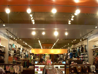
Pacsun located in Four Seasons Mall, uses track lighting throughout the store as its main light source. The track lighting is positioned to be directed on clothing displayed in the store. Most of the lighting is directed to a certain article of clothing or has a specific place to project light. At the cash wrap, there is a large wood veneer light, that I feel is more for looks than function, but it directs the attention of the customer to come and check-out. Also in the back of the store, there are two round wood veneer lights that direct the customer to the sales rack. Both of these lights are interesting and fits the store's atmosphere well, they are used more for direction and way finding in the space rather than light output. This space does have glare issues, dealing with too many lights shining on a certain items, also shining on materials such as metal throughout the space. Decreasing the amount of lights directing towards one area will help solve the problem and make it more appealing to shop in there. With lights everywhere in the space, it makes dark areas from the shadows of the clothes rack, display signs, and furniture/props. I find that this space is too bright, but since this is a clothes store, you want to make customers aware of the clothing and want them to buy items.
Sketch Series #2::Weatherspoon Art Museum
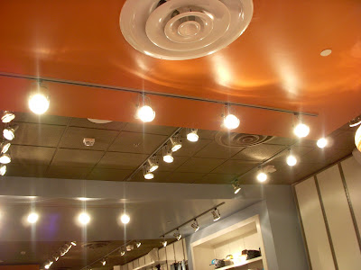
This space is located in the 2nd floor large art gallery located in the Weatherspoon Museum. Track lighting is used throughout the whole space with no other additional fixtures. The lights are positioned depending on the art and how the light should hit the composition. Most of the lights are directed to certain artworks whereas others are not directed to art but the space as a whole. We talked to the security guard and he discussed how the light designer positions every light in the space for each art exhibit, using large scaffolding equipment to reach the lights. I never thought of lighting having to be moved many times to achieve the correct look such as in this room, but reminds me of the technical aspect of lighting design. The way the lights are directed, I do not feel like glare is an issue in this space. From looking at the pictures, it seems as if this art gallery is too bright but when experiencing it first hand, I did not feel overwhelmed. The design of the ceiling is unusual with the insets where lights are located and are divided in sections which might have to deal with the glare/brightness. I feel that the lighting in this space is very effective, it lights the space and directs the attention to the artwork.
Saturday, February 14, 2009
Light Series #1::February 14th 2009
This photograph is taken around 4 p.m, where the pattern has changed. Throughout the day the pattern on the floor gets longer and affects the space more. Also this picture was taken later than the first and you can see that the pattern changes angle throughout the day. By taking pictures at different times, I think I will find a greater success observing daylight.
Monday, February 9, 2009
Computer Lab Evaluation
We chose to analyze the lighting of the computer lab. This is primarily used by students when working on IARC projects. It is accessible 24 hours a day and used for certain projects, programs, research and a classroom for students of all years. The lighting is very bright and hurts the eyes when in there for too long. There are 23 suspended fluorescent lights which seem to be too many for such a small space. The space is both public and intimate in different ways. When having class, you are seating closely to one another which makes this a more intimate space. But the space is also used by many people at different times and can accommodate groups. This space is not the best place to do computer work; the glare on the computers is sometimes distracting. If all possible, I do not use the computer lab, the lighting is too bright for a work environment.
Saturday, February 7, 2009
Inspirational Lighting...
These lights are designed to be focal points in a space. They are creative and distinctive, giving a space characteristics. I love these lights and would want them in my house (well at least the white one, the red one is rather large).
These unique pendent lighting made from wine bottles. It adds an interesting twist to lighting!
Neat lighting effect for a stage atmosphere.
Thursday, February 5, 2009
Kaleidoscope Light Model
In this exercise, we created an interior space that would function as a night club. In this space we played with lighting to create a pattern and texture on the walls around the space. We placed a large diamond on top of a red transparent tube. We then used an LED light to shine from within the tube projecting through the diamond. We did this same thing with three other small diamonds and blue transparent tubes with tea lights. We varied the heights of all the tubes to see what this effect would have. We discovered that the light shining through the diamonds created a kaleidoscope type pattern along the walls, but mainly the ceiling. The blue and red tubes combine to make a magenta tint along the walls. We folded paper in the corner along the back wall with a tea light placed behind it to help create texture. The colors from the tube mixed with the tea light behind the paper mix to create an orange glow.
Subscribe to:
Posts (Atom)